

The Rule of Thirds is one of the most used compositional approaches in photography. According to MoMA.org, composition is:
The arrangement of the individual elements within a work of art so as to form a unified whole; also used to refer to a work of art, music, or literature, or its structure or organization.
The rule of thirds is one way of organizing elements within a frame of photography, in effort to most effectively communicate an artist’s vision. Usually, the purpose of a photograph is to say something to the intended viewer, or perhaps to invite questioning in said viewer. When a photograph is arranged with attention to the ‘rules’ of composition, it often is able to more effectively accomplish its purpose.
The Rule of Thirds | When it Works
The basic idea of using the Rule of Thirds (ROT) is to place an element or area of the frame that is of utmost importance on one of the intersections, or lines, of the compositional guide. The guide is created by drawing two horizontal and two vertical lines across the frame, such that the frame is divided into thirds, both vertically and horizontally. Placing lines, or planes, such as horizons, fence lines, edges of furniture, telephone poles, etc. along one of the horizontal or vertical ROT lines helps to create a frame that feels balanced, but not static, as can happen when centering strong lines.
The intersecting points of the ROT gridlines are often referred to as ‘power points’ and are considered to be strong placements for a subject’s eye, the bridge of their nose, a focal flower in a picture of a bouquet, a lone tree in a landscape or any other part of the subject or scene that is the focal point of the image. Let’s take a look at some effective uses of the ROT:
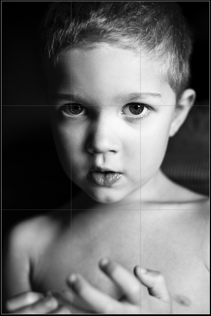
The above image shows how the ROT works wonderfully for a classic portrait, shot with the camera held in portrait orientation. Placing the subject’s eyes on the upper ROT gridline results in a comfortable composition, while the viewer’s eye is pulled directly into the subject’s expression.
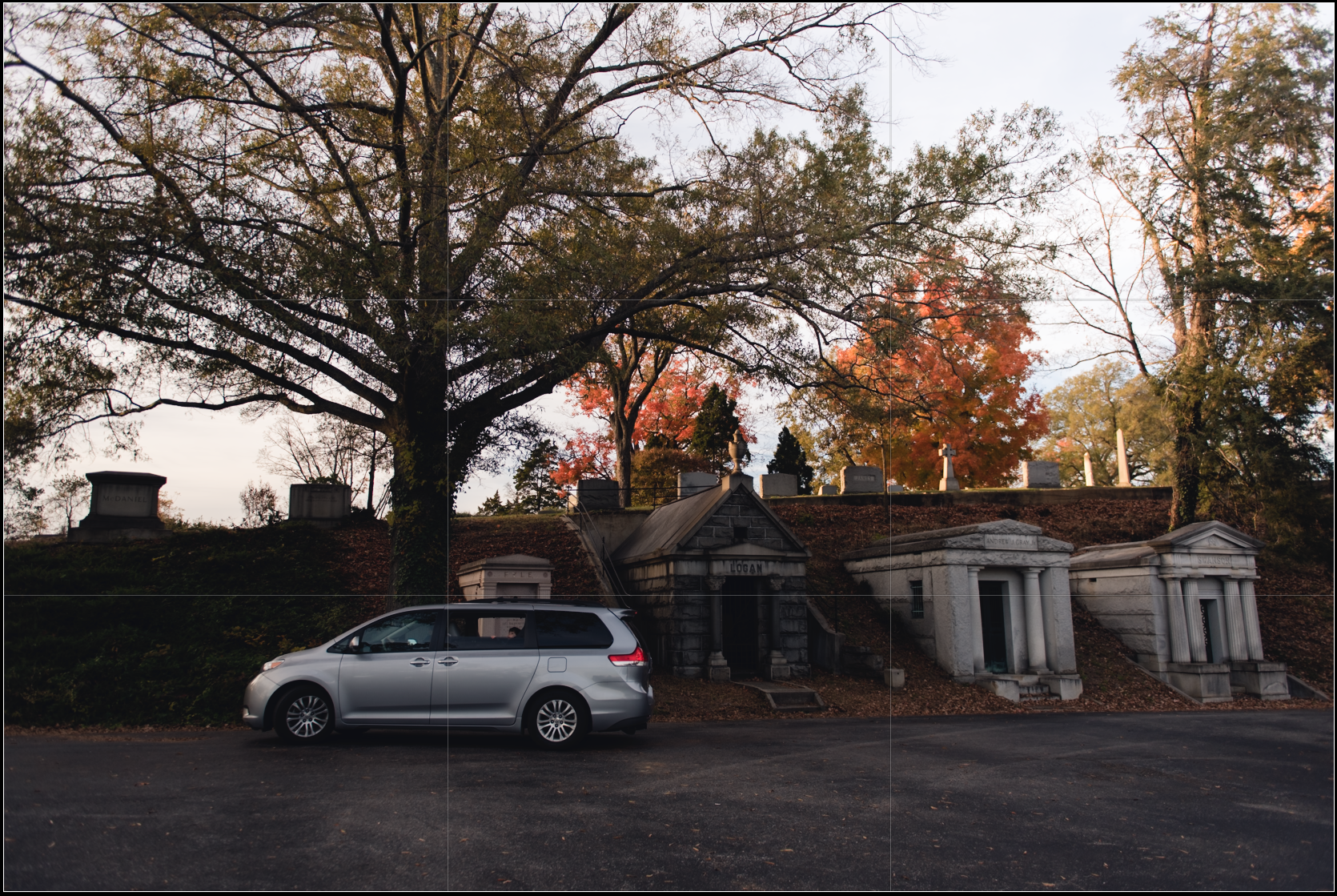
In image above, the top of the van is placed along the lower ROT gridline, while the car is also roughly centered over the left gridline. The trunk of the main tree in the frame also extends up the left gridline, while the visually attractant orange tree on camera right is placed on the upper right power point, helping to balance the visual weight of the van on the left.
Above, the child’s face is placed squarely on the upper left power point, while the bulk of the visual weight of the frame is arranged on the far left third of frame.
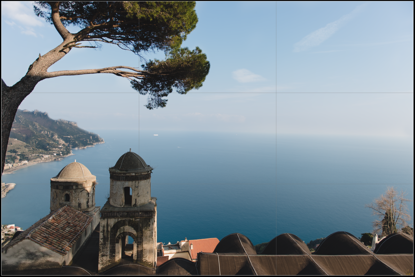
This image represents the decision making that using the ROT compositional guide often requires. I could have chosen to place the horizon along the upper ROT gridline, but I would have then lost most of the tree at the top of the frame. If I had placed the horizon on the lower gridline, I would have lost the majority of the buildings at the bottom of the frame. Instead, I chose to place the most interesting building, which holds the most tonal contrast, on the lower power point, letting the horizon fall just slightly above the vertical center of the frame. Strict adherence to a guide is a common mistake when learning about composition. It is very important to take all of the elements of the frame into account and weigh the ‘textbook’ use of a guide with the loss of impact that might occur from the necessary cropping to adhere the guide.
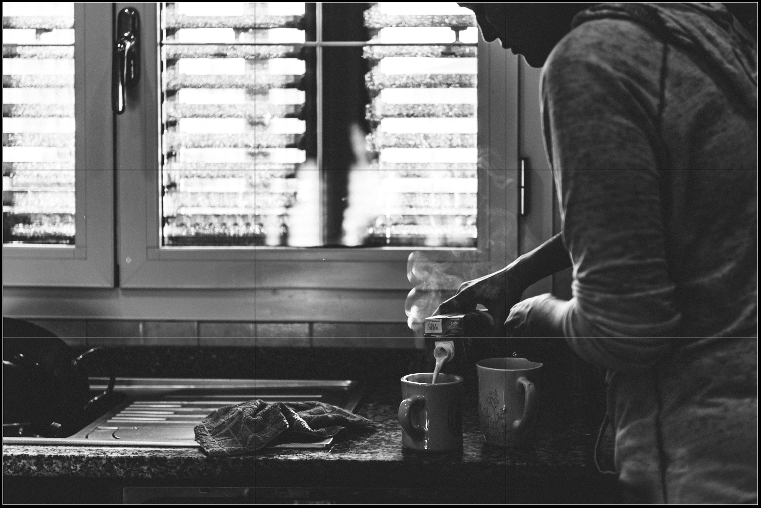
Above, I placed the focal activity, pouring of milk into steaming coffee, on the lower right power point. The strong horizontal line created by the break between dark granite and lower tile follows close to the lower gridline.
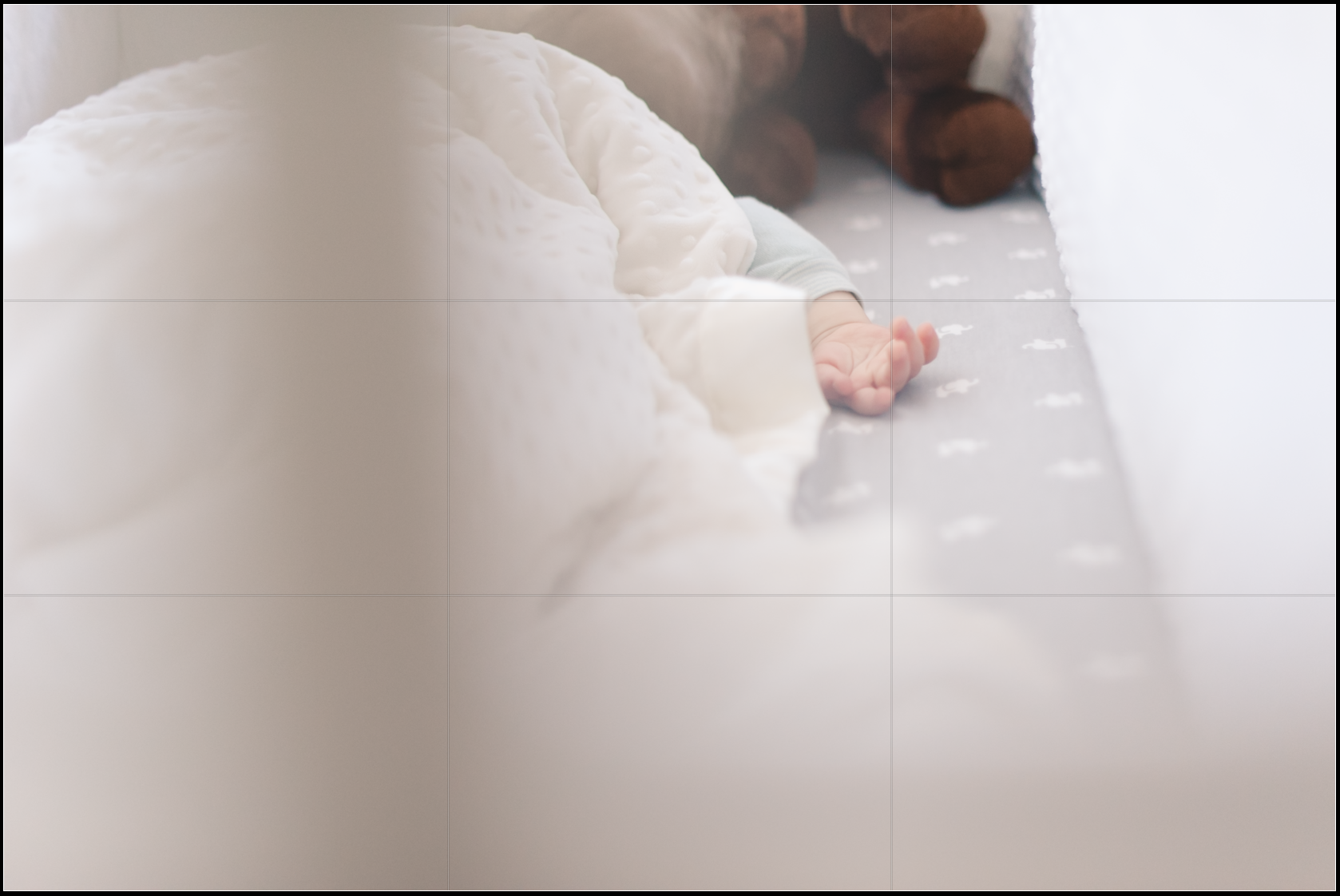
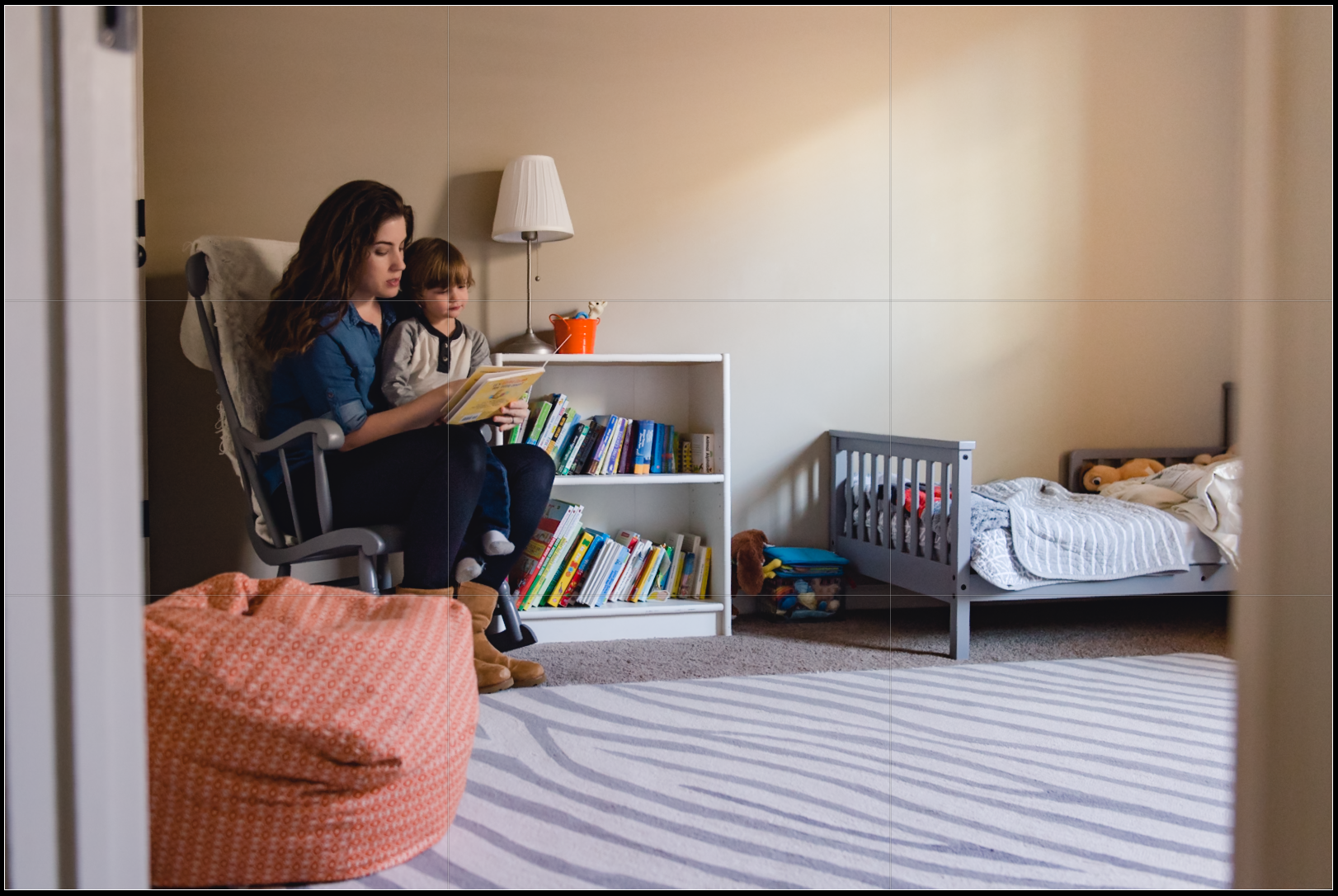
In the simple frame above, baby’s hand is placed at the upper right power point, while the blurred line created by the crib slat borders the right ROT gridline.
The Rule of Thirds | When to Let it Go
Although the ROT is a great compositional tool, it doesn’t always create the strongest composition. Sometimes an image is best served by either completely ignoring the ROT, or allowing the focal point of the frame to fall slightly off of the compositional guide. Here are a few examples:
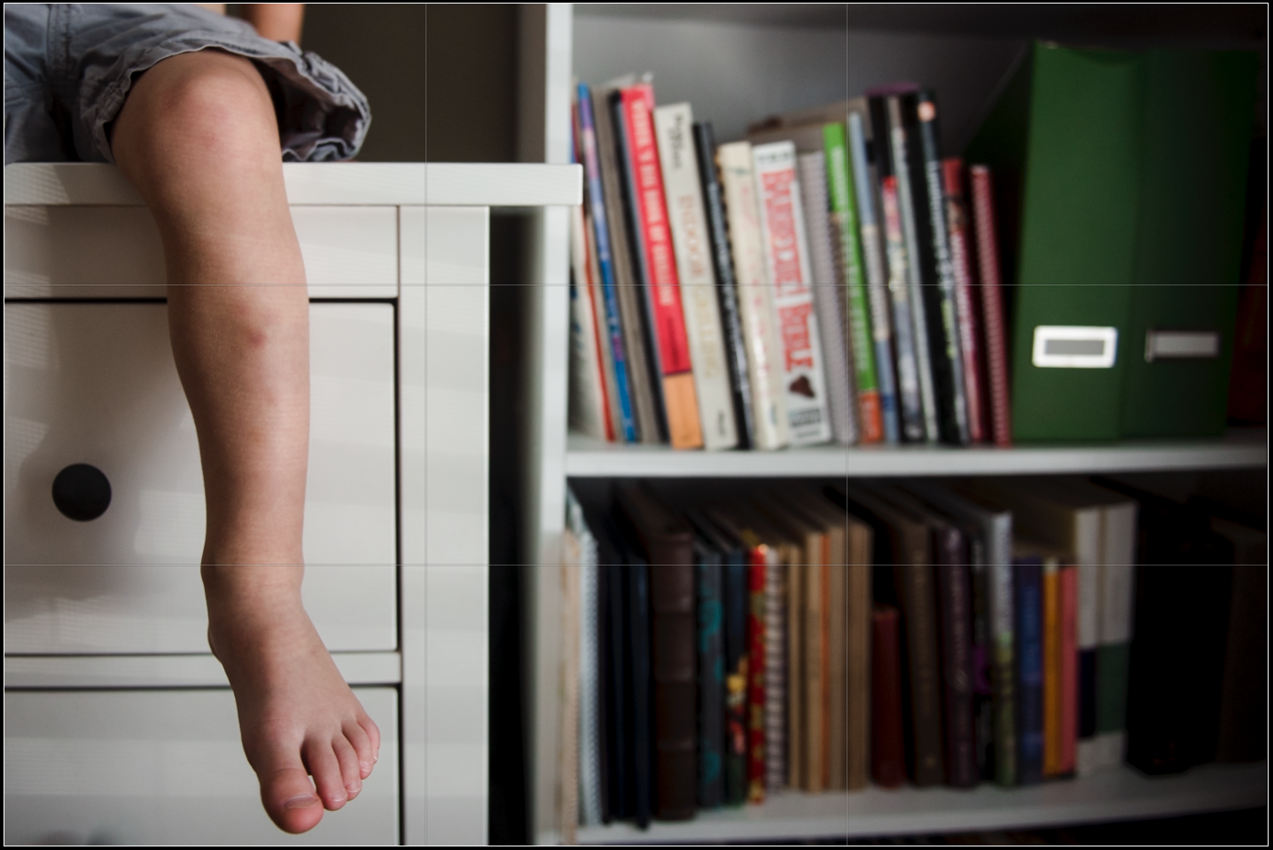
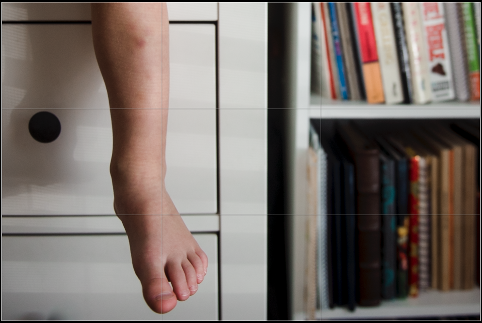
I prefer the top version of the above image. When cropped to place the leg on the right ROT gridline, much of the surrounding environment is eliminated from the frame. Of course, this could have been adjusted in camera, if I had taken a step back shifted to my left. However, doing so would likely have included both of the subject’s legs in the frame, and I was aiming for a quirky, creative composition with this image. Thus, the ROT wasn’t the best fit for this frame.
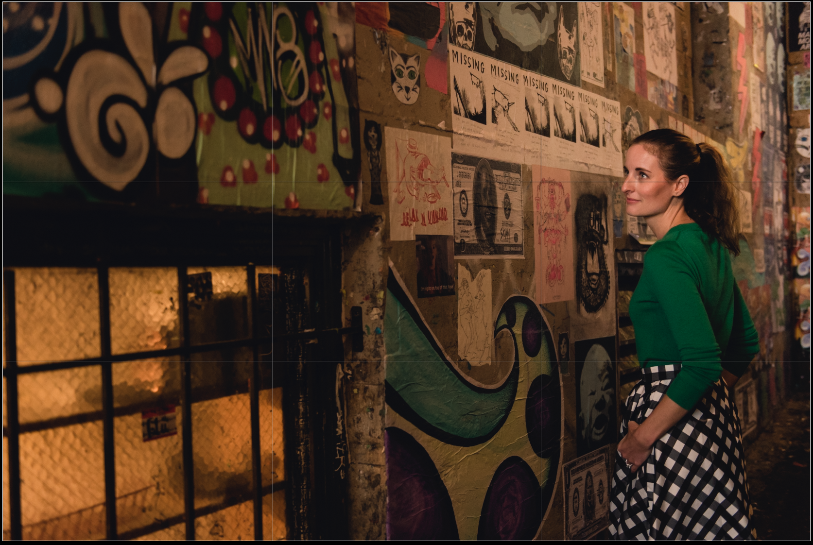
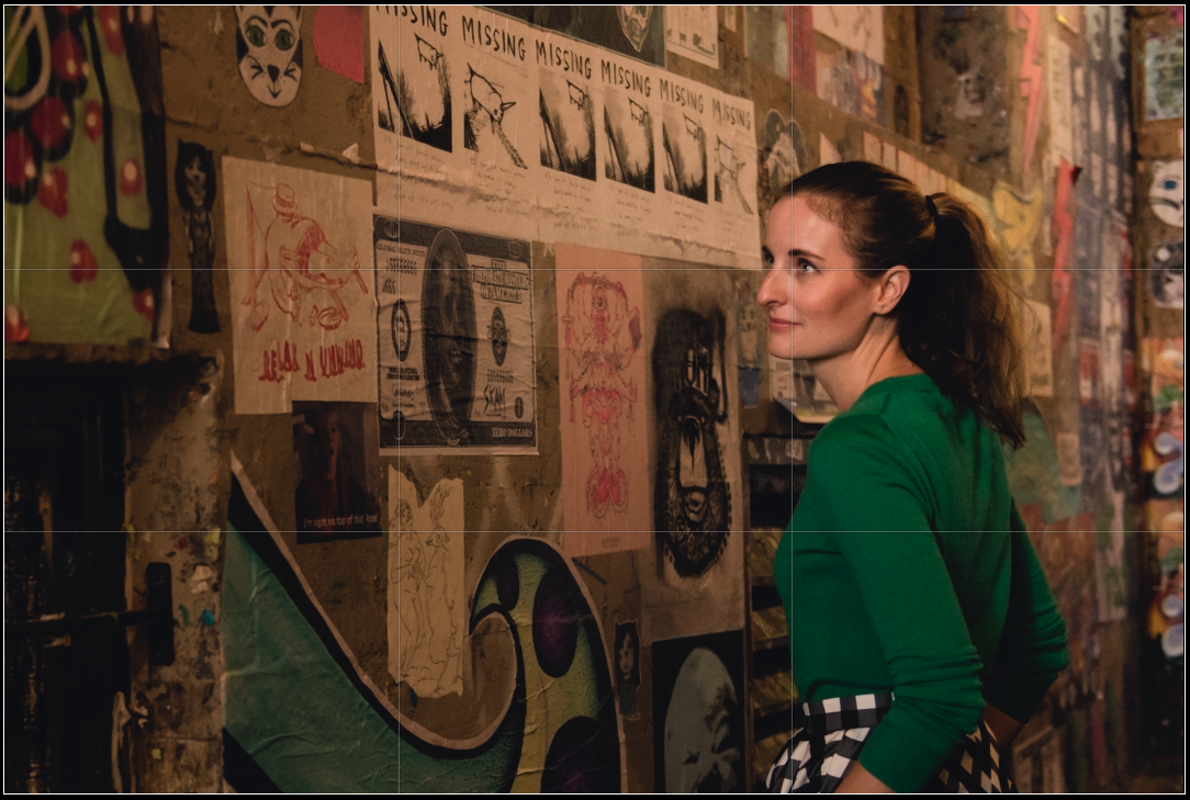
Again, I prefer the non-ROT crop for this frame. Placing the subject’s eye on the upper right power point does draw my eye, as the viewer, directly into the subject’s expression. However, this image is most definitely an environmental portrait. I want the viewer to explore the wall on either side of the subject. Also, I prefer that the subject’s entire camera left hand/arm be visible in the frame, rather than awkwardly chopped near her elbow.
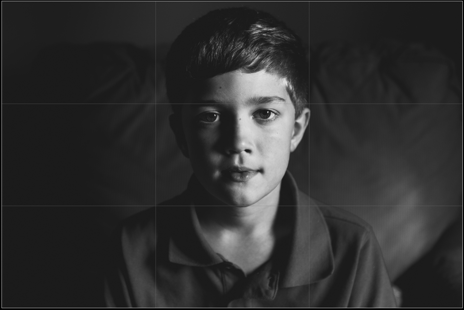
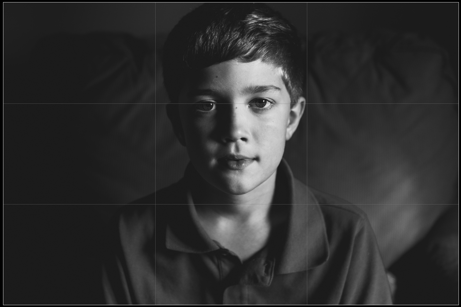
This image pair illustrates a common issue when cropping a tight portrait to the ROT guidelines. I prefer the top crop, as it includes all of the subject’s head. When chopping through a head, or limb, I want that chop to feel very deliberate. My viewer should not be left wondering if the chop was an oversight. While the bottom image does fit the ROT guide perfectly, the head chop is extremely slight, and therefore not deliberate enough for me.
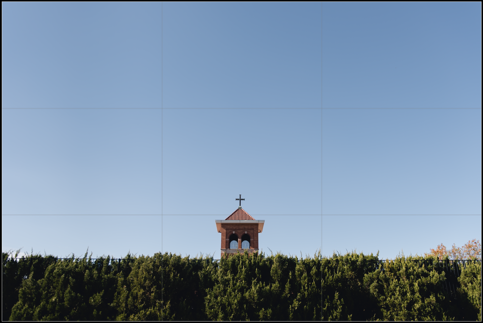
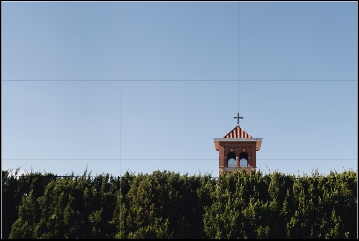
Finally, this image set illustrates that sometimes compositional choices are simply ambiguous. In my opinion, neither the centered composition, nor the ROT composition is clearly stronger. I like that the church tower is smaller and more visually isolated in the centered image (though I think the impact of the image could be improved if the orange trees on camera right were cloned out, thus perfecting the symmetry of the frame) but I like how the eye is led along by the fence to rest on the tower in the ROT orientation. In this case, it is up to the photographer, as the artist, to decide which orientation best suits their vision for the story the frame is telling.
Do you often use the Rule of Thirds? Or, do you prefer a different compositional guide? Let me know in the comments.
-M
Pin It